The GTK-Stream protocol
The GTK-Stream protocol consists in sending graphical commands (such
as "create a window", "append a widget", "change a property") to the
standard input of a running gtk-stream process, and listening for
user input events (button clicks, file dialog selection, window
closing) from the process' standard output.
GTK-Stream expects a well-formed XML document on its standard input, which it parses incrementally. This means a message will be handled as soon as it is written, and may depend on previous messages, but not on future ones.
The root element of the protocol is the <application application_id="$ID">
tag, containing zero or more messages. When this tag is closed (and
the document ended), the application will exit regardless of any open windows.
GTK Stream messages
A message to GTK Stream will tell it what to do.
Add a stylesheet
- Tag :
<style> - Children : a text node, containing some GTK-specific CSS
Add a stylesheet to the application.
The styleshet is applied as soon as the </style> end tag is
parsed, but if you want to avoid any flickering, it may be wise to
define a stylesheet before opening any windows.
GTK only handles a subset of CSS. Addtional information can be found in the GTK documentation :
Examples :
- Turn all buttons red :
<style>button { color: red; }</style> - Add padding to all widgets with the "big" class :
<style>.big { padding: 10px; }</style>
Add to the icon path
- Tag :
<add-icon-path path="$PATH" />
Add the given path to the GTK search path for icons.
When GTK searches for an icon with a given name (for example, when
setting a window's icon-name property), it will look into that path
for image files situated at
$PATH/$THEME_NAME/$ICON_SIZE/$ICON_CATEGORY/$ICON_NAME.* where :
- the
$THEME_NAMEis the name of the current GTK theme, orhicolorif is doesn't find the icon in its theme - the
$ICON_SIZEis one of many sizes of icons, such as16x16,22x22,48x48, etc. If you only have a single icon, and want it scaled up or down, GTK will also search in ascalabledirectory if it doesn't find a fixed-size version - the
$ICON_CATEGORYdepends on the context where the icon appears
For a (non-exhaustive) list of icon sizes and categories, see the hicolor theme definition. The "Directories" variable lists all the places where GTK might look within your path.
To simply set an icon for a window, the easiest way is to put your
icon file in the hicolor/scalable/apps subdirectory.
Open a window
- Tag :
<window id="$ID"> - Children : exactly one widget
Open a window containing the child widget. Additional window properties (such as a title, or default-width and -height) may be set by providing an attribute with the same name as that property.
The window may be closed using the <close-window id="$ID" /> message.
When it is closed (either programmatically or by the user), it emits a
$ID:window-closed event.
Close a window
- Tag :
<close-window id="$ID" />
Close the window with the specified ID.
Modify a widget property
- Tag :
<set-prop id="$WIDGET_ID" name="$PROP_NAME" value="$NEW_VALUE" />
Set the property PROP_NAME on the named widget to a new value.
Properties can be any declared GObject property of the target widget. You can find those in the "Properties" section of the documentation for that widget (for example, here are the properties for a button)
Insert widgets into a container
- Tag :
<insert into="$ID"> - Children : zero or more widgets
Append the given widgets to a container. Depending on the container,
the widgets may need to be wrapped in the corresponding tags (for
example, within a <cell> if you are adding widgets to a grid).
Remove a widget
- Tag :
<remove id="$ID" />
Remove the named widget. After that, it will no longer be visible, or receive events.
Open a file chooser dialog
- Tag :
<file-dialog id="$ID" parent="$WINDOW_ID" />
Open a file chooser dialog. It is modal by default, so the parent window will not receive events while the dialog is active.
When a file is chosen, the chooser will emit a
$ID:selected:$FILE_PATH event. If the user closes the dialog without
choosing a file, a $ID:none-selected event will be emitted instead.
GTK Stream Widgets
Some messages accept widgets as children. Here are the widgets that GTK Stream can create.
All widgets handle setting initial values for their properties. All properties are optional, except for the ones that appear in the description of the widget.
Non-interactive Widgets
The following are mainly used for presentation, and will not emit any events.
Labels
- Tag :
<label text="$TEXT" />
Create a label, to show a short message.
Pictures
- Tag :
<picture />
Create a picture. You
can set the picture's file property to show a given image file.
The file is opened by the GTK-Stream process, which may have a different current directory than the one of the pilot application, so it is usually preferrable to specify full paths to images rather than relative ones.
Icons
- Tag :
<icon />
Create an icon (a GTKImage) from the given file.
Contrary to a picture, an icon has a fixed size, and will not grow beyond it. Otherwise, it functions pretty much the same as above.
Progress bars
- Tag :
<progress-bar />
Create a progress bar, with an optional id. The progress bar advancement can be updated by setting its "fraction" property
Separators
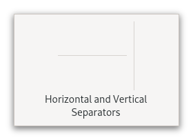
- Tag :
<separator />
Create a separator, to mark a visual distinction between two adjacent widgets.
Interactive widgets
The following widgets will usually serve as "interaction points" for the user. They will emit events according to what the user does with them.
Buttons
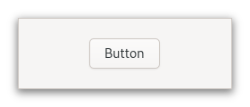
- Tag :
<button id="$ID" > - Children : another widget, for the button contents (usually a label)
Create a button, identified by an id.
When clicked, the button will emit an event of the form $ID:clicked.
Links
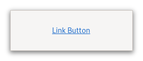
- Tag :
<link id="$ID" > - Children : another widget, for the link contents (usually a label)
Create a link button, identified by an id.
When clicked, the button will emit an event of the form $ID:clicked,
just like a <button>. The default link-opening behaviour of
GTK is inhibited, in favour of letting the pilot application choose
its own behaviour.
Switches
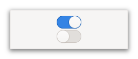
- Tag :
<switch id="$ID" managed="$MANAGED" />
Create a switch.
When clicked, the switch will emit an event of the form
$ID:switch:$NEW_STATE where $NEW_STATE is on or off.
Sometimes, switching something on takes a little while, and the user still needs to know that their interaction has been taken into account.
Setting the managed property to true does just that. A managed
switch doesn't change color when switched on or off, and it is up to
the pilot application to set the switch's state when the underlying
logic is done with the switching.
Scales
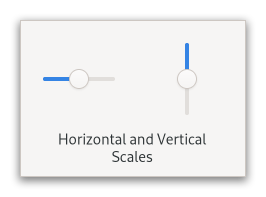
- Tag :
<scale id="$ID" adjustment="$MIN:$MAX:$INITIAL" />
Create a scale, to let the user position a value between a minimum and a maximum.
When changed, the scale emits an event of the form
$ID:changed:$NEW_VALUE where the value is a floating point number
between $MIN and $MAX.
Dropdowns
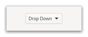
- Tag :
<dropdown id="$ID"> - Children : one or more
<item key="$K" value="$V">, each containing a widget.
Create a dropdown, offering a choice between all of the given items.
When an item is selected, the dropdown will emit an event of the form
$ID:selected:$KEY where the key is what was specified in the
corresponding <item> tag.
You can activate a search functionality for the dropdown by setting
enable-search="true", and search-match-mode="$MATCH_MODE" where
MATCH_MODE is one of exact, prefix or substring. If you do so,
the item values will be used as keys to perform the search.
Entries
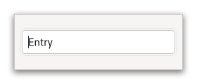
- Tag :
<entry id="$ID" />
Create a text entry.
Every time the text changes, the entry will emit a
$ID:changed:$NEW_CONTENT event.
Container widgets
Those widgets won't serve as interaction points, and instead will handle the layout of other widgets.
Boxes
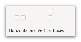
- Tag :
<box> - Children : zero or more "naked" widgets, or widgets within a
<box-prepend after="$ID">to insert widgets after another child (the previous child must have been inserted beforehand).
Create a box with several child widgets contained inside.
Flow Boxes
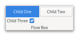
- Tag :
<flow-box> - Children : zero or more "naked" widgets to append them at the end
of the box, or widgets within a
<flow-box-prepend>to prepend them instead
Create a flow box with several child widgets contained inside.
Panes
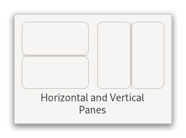
- Tag :
<paned> - Children : one or more widgets
Create multiple nested panes, with adjustable handles to allow resizing.
Frames
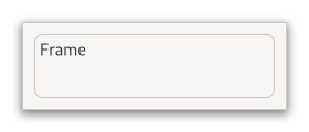
- Tag :
<frame> - Children : a "naked" widget to set the content, and/or a widget
within a
<frame-label>to set the frame label
Create a frame, containing a widget, with an optional label if specified.
Grids
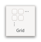
- Tag :
<grid> - Children : zero or more
<cell x="$X" y="$Y" w="$W" h="$H">, each containing a single widget
Create a grid, and attach each child widget to it according to the coordinates of its cell.
Scrolled windows
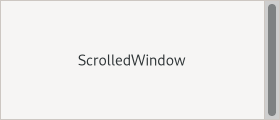
- Tag :
<scrolled-window> - Children : just one widget
Wraps a widget in a scrolled window, that adds scrolling capabilities (and optionally, a frame) to widgets that don't have them natively.
Stacks
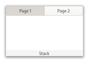
- Tag :
<stack> - Children : zero or more "naked" widgets, or widgets wrapped in a
<stack-page title="$TITLE">
Make a stack from
several widgets. You can select the visible child of the stack by
setting its visible-child property to the ID of that child.
Stack sidebars
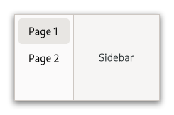
- Tag :
<stack-side-bar stack="$STACK" />
Make a stack sidebar associated to a stack.
The sidebar will display a button for each <stack-page> child of the
sidebar, showing its title attribute. Widgets that were added to the
stack without a title will not be shown in the sidebar.
Pseudo-widgets
Some containers need additional information about their children to lay them out properly. For example, a Grid needs its children to be inserted at certain coordinates, and a Frame can contain both a "label widget" and a "content widget".
To handle those cases, widgets may be wrapped within special tags
(such as <cell> or <frame-label> for the cases
above) that only provide positional information within a parent.
Those tags are what GTK-Stream considers "pseudo-widgets". They may appear anywhere other widgets can, with the following caveats :
- since they do not correspond to GTK widgets, they may not be
identified with an ID, and may thus not be
<remove>d (to remove a pseudo-widget, you have to simply identify and remove its underlying child) - for the same reason, they may not contain any GTK properties. Any property of a child widget must be specified on the child, not on the pseudo-widget that contains it